
 |


 |
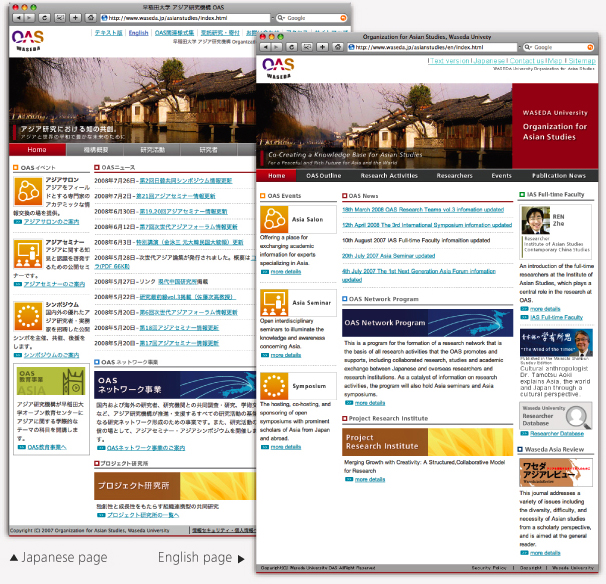
Japanese navigation labels are a fairly consistent length, roughly four characters long, whereas in English the length varied greatly. In order to accommodate for these differences in the interface, I designed a different global navigation structure for the English and Japanese versions. |
For the Japanese version, I used consistently sized square buttons that are very popular with Japanese web sites. For the English version, I created buttons that were flexible and could account for the different lengths of navigation labels. |

 In order to make it easier to update both versions of the site,
I designed a consistent layout. Adding a new image to one site automatically updates the other, saving the client time. I designed flexible spaces for the interface to allow the expansion or contraction based on the display of the chosen language. |

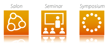 OAS puts on three different types of events per year. Differentiating the event types from one another has been challenging for their website audience in the past. My goal was to illustrate a visual distinction between the three events, offering a quick intuitive differentiation that didn’t require lengthy explanation. I created a series of icons that represented each event type and displayed them prominently on the left column of the website. After launching this iconography, there was a noticeable increase in event attendance. |