

 |


 |
Texting 4 Health
This conference explored the theme of using text
messages to promote healthy behavior.Sponsored in part by the Centers for Disease Control and Prevention, this event took place at Stanford University. The combination of a cell phone and stethoscope illustrates the core theme of the conference – the link between mobile communication and health. |
 |
Mobile Persuasion
The Stanford Persuasive Technology Lab examines
how mobile technology can be designed to
change what people believe and what they do. Much like human persuaders, persuasive interactive technologies can bring about positive changes in many domains, including health, business, safety, and education. This logo is derived from the fact that the cell phone gives us good ideas and can change our behavior. |

 |
Stanford University
Peace Innovation is one of several projects of the Stanford
Persuasive Technology Lab.The project's premise is that
with new digital tools, world peace is possible in 30 years.Peace Innovation To design this logo, I examined peace symbols from all over the world, and found there were few common images. The dove stood out as a universal symbol. I combined this with the sun image; the sun shines equally on all the earth's people. This logo conveys the hope of building a more unified world. |

|
Waseda University
IAS researchers Asian culture, future, and
relationships.Institute of Asian Studies Asia comprises a huge area from Japan to the Middle East. It includes a lot of different culture and histories. Therefore, determining a symbol to represent Asia was difficult. This logo using sun and wind comes from the East. It means this institute based on Japan, and they want to send important information from the East to Asia. |

 |
Osamu Dazai
Dazai is one of the most famous novelists in
Japan. There is a centennial celebration of Dazai's birth in 2009. I designed this logo for a campaign by a local government. This logo is being used on banners, goods, pamphlets, signs, museums, and books. We can see this logo around the city that Dazai lived. |
 |
Oze national park
Oze is Japan's most famous national park.The park is covered with swamplands, and the park's emblem is "skunk cabbage" (a distinctive white flower). I used the flower's unique shape, combined with a representation of the swamplands. This logo was submitted to a competition for the national park's new logo. |

 |
MAJESTEC
This logo was developed for a construction firm
in Japan. The logo image is derived from the
shape of an excavator.I also created company name, a blend of the terms "majestic" "technology" and "technique." The underlying concept behind the logo is "this company breaks the mold by combining skill and machine." |
 |
VIVACE
I created this logo as the winning entry in a
competition sponsored by a Japanese beautysalon.The salon's interior features circular furniture, which is reflected in the central shape (modeled after the entrance of salon). I also designed advertisements for Vivace in several magazines, based on this theme. |

 |
"Hito, Koto, Mirai"
This logo is for an exhibition of design. The exhibition theme was "Human, Thing, Future".These three parts work together, so I composed this design with triangular parts. Pink conveys human and love; orange conveys innovation; and blue conveys the future. Pink and blue are connected, showing that humans and the future are linked through innovation. |
 |
Universal Storytelling
This logo is for a research project based on animations that convey universal stories through the use of basic shapes. I needed a lot of people's feedback for this project, so I focused on creating something that would pique their interest. |

 |
Teach Peru
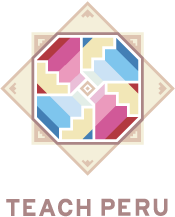
Teach Peru is an organization created with the mission of improving education in Peru by engaging Peru's top talent in learning about the cause and involving themselves as teachers for underpriviledged children in poor schools.The logo image and color are derived from the pattern of Andes textiles. I combined pencil with those elements. |
 |
Information Design Lab
This is the logo for the design department of an information design program.They work in many design fields, so rather than create a symbol, I proposed a very simple text-based design. One of the purposes of this group is to create a clearly defined structure for presenting information. I think information design and architecture are close – both must consider human actions first and foremost. This logo reflects the architectural aspects of information design. |

 |
Market for change
Market for change is a social enterprise that
promotes socially responsible business processoutsourcing. They wanted their logo to feature a typical outsourcing worker to present the people side of the industry. This design was created for the organization's website. |
 |
NGO for Africa
This logo for NGO.The groups supports to african children of educational system. So I used silhouette of african child, and feather pen. Feather come from fly to big hope, and those color come from children's individuality and bright future. |

 |
Kindergarden kids
This logo is for kindergarden kids that perform in a dance troupe using bells.When I discussed this order with them, I felt they wanted something crisp and clean-looking. I chose to use a lily of the valley silhouette in the logo to convey this concept. |
